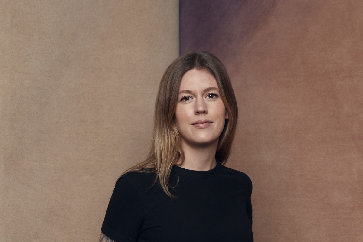
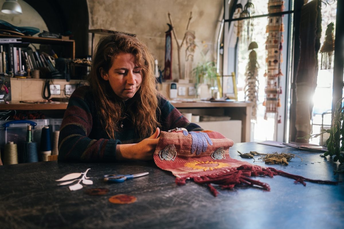
In Conversation with Gill Thorpe
Tell us a little about the new design…
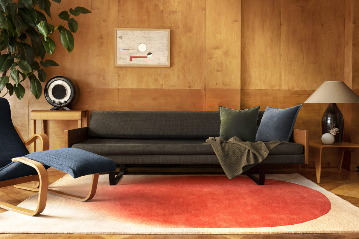
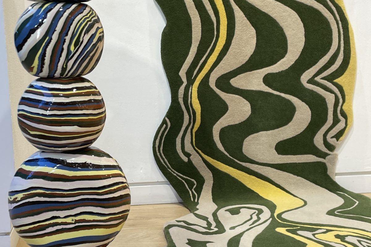
It’s a mix between Rigg & Furrow 03 and Curb Reflective which I decided to put together because of these being my first and latest collections produced with FLOOR_STORY.
The 10 x 10 FLOOR_STORY editions held the perfect opportunity to unite my favourite aspects from each of the collections to create something fresh. The gradients which I developed in the CURB collection, is one of my favourite features because of how they create the illusion of more colours.
Whose work are you drawn to and have been inspired by?
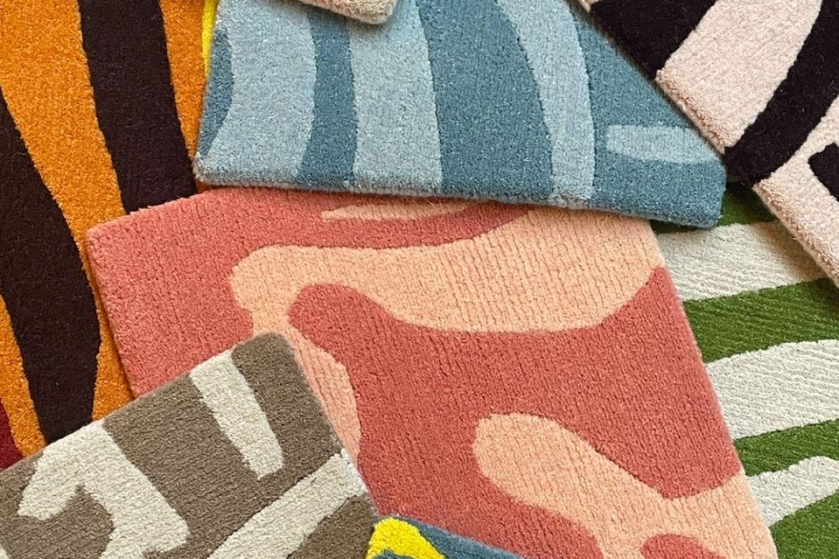
I’m drawn to the works of Karel Martens, Henri Matisse, Hella Jongerius and Margrethe Odgaard because they all have a strong use of colour in their work. Matisse & Karel work with print techniques, but in very different ways, whereas Hella and Margrethe are product designers who have had a huge influence on my work.
I see similarities in each of these designers through their unique language of colour. I suppose it says a lot about how I’m drawn to the sentiment of process informing design because I also have a very methodical approach to my design work.
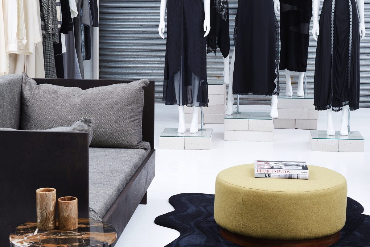
Your colour palettes tend to be either earthy or brighter tones, this one is a mixture of both - what kind of mood are you setting and in what kind of space do you see the rug?
It's very bold in the way it uses orange & blue which are very bright, so I see this in more of a minimal space with the rug being the focal point. A lot of the time, when customers are looking for a rug, they present a blank canvas of a space in need of something to give a certain energy and I think this is a great one for those instances.
The textural detail with the gradient makes a perfect pair with raw and tactile materials within a stripped back space. It’s also really easily customisable because of the nature of it only including three colours in varied techniques like the deep carving, colour blocking and gradients.
What’s an object that you possess that holds a sense of sentimentality in your home ?
I collect screen and risograph prints from my friends who are graphic designers. They come in all kinds of vivid colours and textures so they’re all pretty varied.
These prints are really important to me not just because of the aesthetic but because they’re made by mates of mine and I like to support people that I know in their artistic endeavours as well as contextualising my background of being from Ireland. It’s nice to see everyone develop and evolve over time whilst being reminded of our roots.