CASE STUDIES
Trifle* Echo Branding in MOOs Workspace Rework Through Colour Matching
Adding customised rugs was a brilliant way of honing in on the visual language of the brand throughout the space so that the team and visitors feel at one with aesthetic and values of the brand.
Details
Customer
MOO
Location
LABS Camden
Date
2023
Lead Time
12 weeks
Credits
Interior Design by Trifle*
Features
CUSTOM COLOURWAYS
COLOUR MATCHING ALIGNED WITH BRAND GUIDELINES
ANTI SLIP UNDERLAY
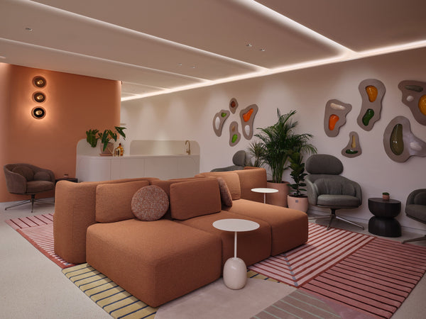
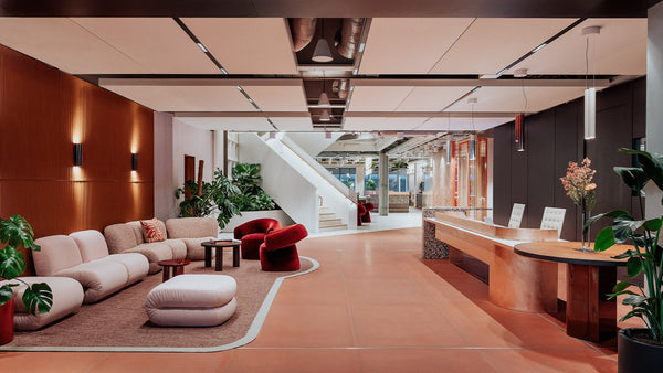
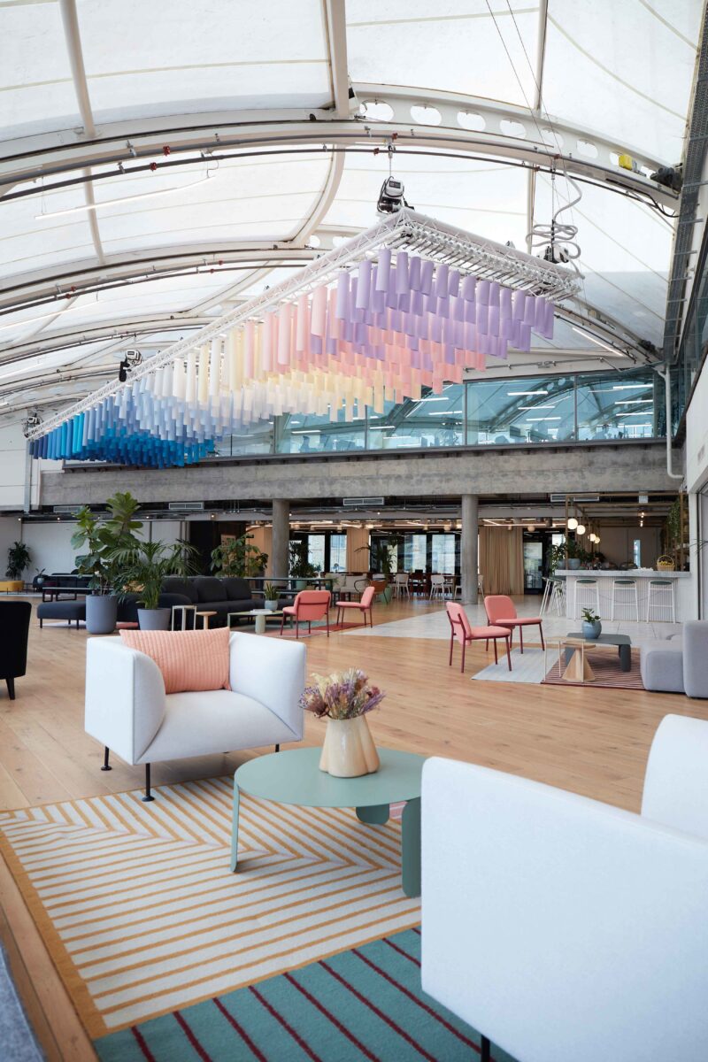
MOO’s new headquarters in LABS Camden needed to align with the post-Covid approach to workspaces. To cater for the everyday and to bring a feeling of inspiration, interior design studio Trifle* created a dynamic space that elevates the brand through details like custom-made rugs featuring the colours in MOO’s branding.
Trifle* have designed a space that feels welcoming and uplifting with a mixture of collaborative spaces as well as meeting rooms, tailored to the needs of different types of everyday working needs.
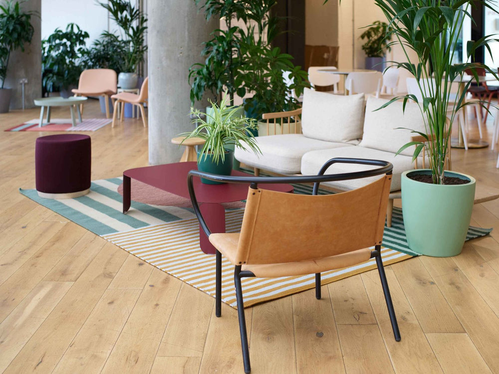
CREATING BESPOKE RUGS WITH FLOOR_STORY IS A BRILLIANT WAY TO UTILISE 'BRAND’ COLOURS WITHOUT IT FEELING HEAVY HANDED OR 'CORPORATE'. LAYERS OF INTERIOR TOUCHES LIKE THIS ARE WHAT ENSURE THE SPACE FEELS CHARACTERFUL AND UNIQUE TO THE BUSINESS' PERSONALITY.
Emma Morley, Director of Trifle*
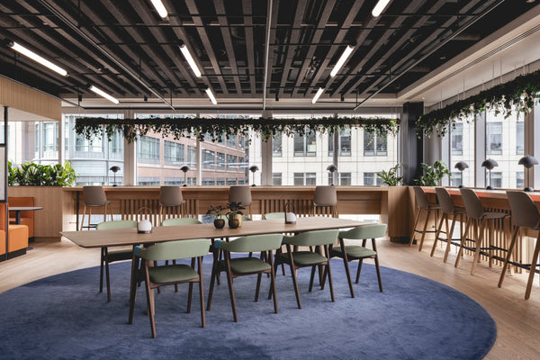
The muted tones in MOO’s branding can be seen throughout the space and the team at Trifle* customised the bold, geometric Rigg & Furrow collection editing the original design to include pink, yellow and mint hues. Laid on wooden flooring, each rug has an anti slip underlay, an absolute must in a workspace environment.
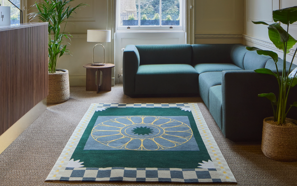
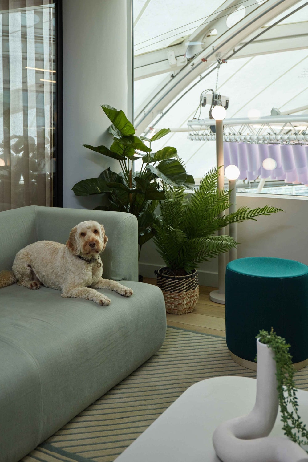
In one of the bright and cosy meeting rooms lies a Casa rug by Kangan Arora in a tufted construction to add further depth to the space. Again this rug was customised to perfectly match the mint in the branding and is surrounded by complimentary tonal furniture pieces.
GOT AN INTERESTING PROJECT?
Get In touchRelated
Gill Thorpe
Rigg & Furrow 01 Violet
Gill Thorpe
Rigg & Furrow 01 Hawthorn Tufted
Gill Thorpe

